 Alan Schwegler
Ranger: a scanner interface for one hand and no touchscreen.
Ranger is Brady's rugged handheld barcode scanner — built for warehouses and plant floors, not desks. My job was the on-device experience: a full UI for a small non-touch screen, driven entirely by a physical keypad, used one-handed and often gloved by people who'd never read a manual. I designed the screens, the icon system, the charging and battery states, and the keypad layout — then put it through moderated user testing in more than one language.
The work at a glance.
- The problem
- A small, non-touch scanner needed to work one-handed, often with gloves and no manual.
- My responsibility
- Led the on-device UI, icon system, keypad layout, and usability testing.
- The key decision
- Design around physical navigation and recognizable barcode types, with explicit battery and charging states.
- The outcome
- The product shipped as Brady V4500. The design covered 18 icons and five charge states, with testing in two languages.
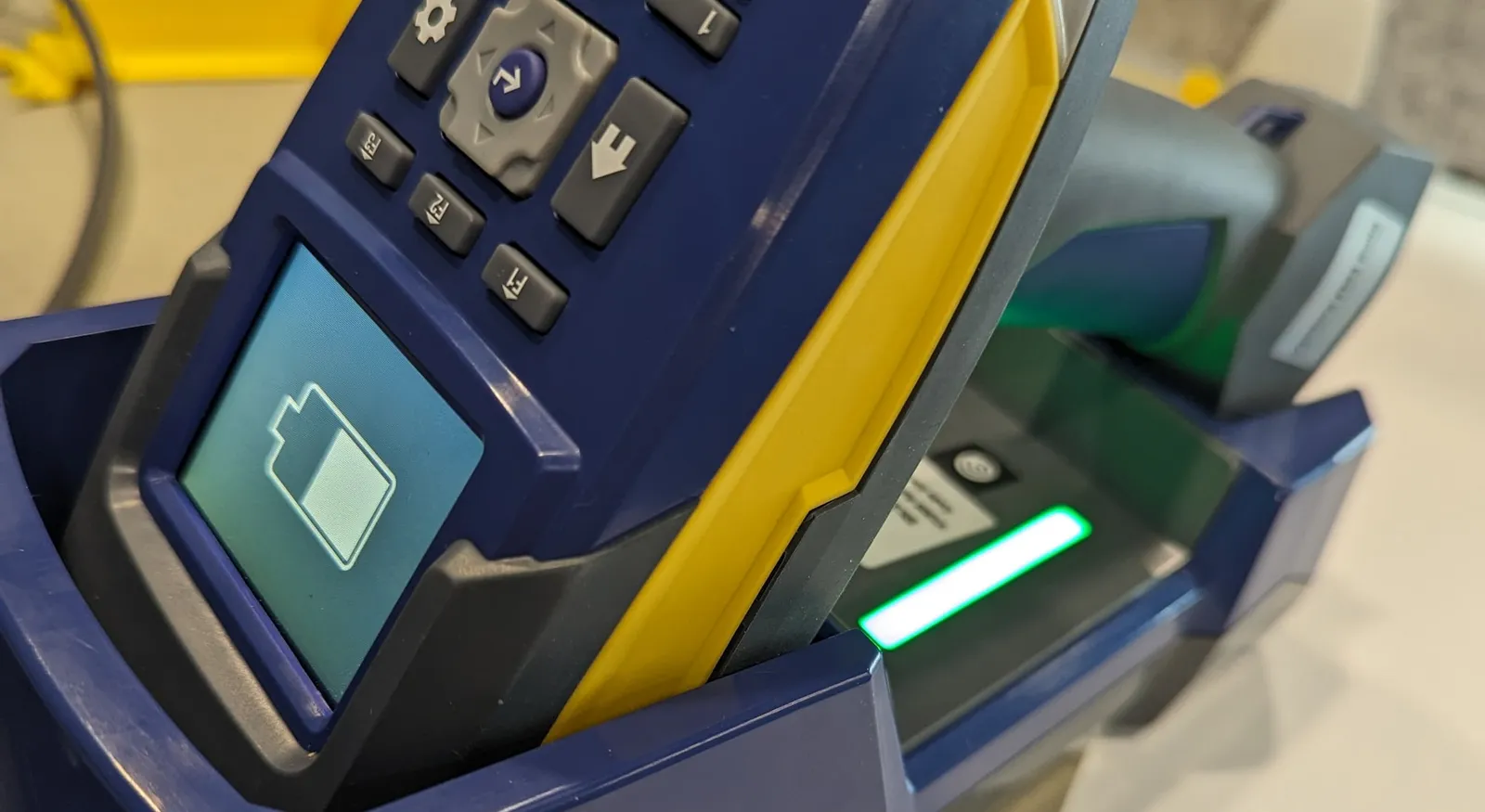
A UI for the plant floor, not the desk.
Ranger is Brady’s rugged handheld barcode scanner — the kind of tool that lives on a warehouse belt or a plant-floor bench, gets dropped, and has to keep working. It scans barcodes, connects to a host over Bluetooth or cable, and runs its own on-device interface. There’s no touchscreen: every action happens through a physical keypad and a screen not much bigger than a matchbook.
I owned that on-device experience — the main scanning screens, barcode-symbology selection, host connection, settings, and the full battery and charging story, plus the icon system and keypad layout that tie it together. The constraint was the design: a few square inches, hard buttons, one hand, and users who would never open a manual.
With no touchscreen and no manual, every icon and every keystroke has to be obvious the first time.
The core constraint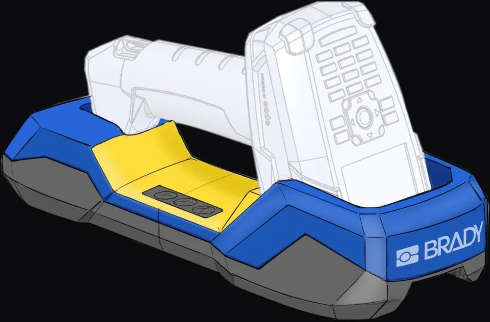
Three constraints that shaped the UI.
No touch, no manual
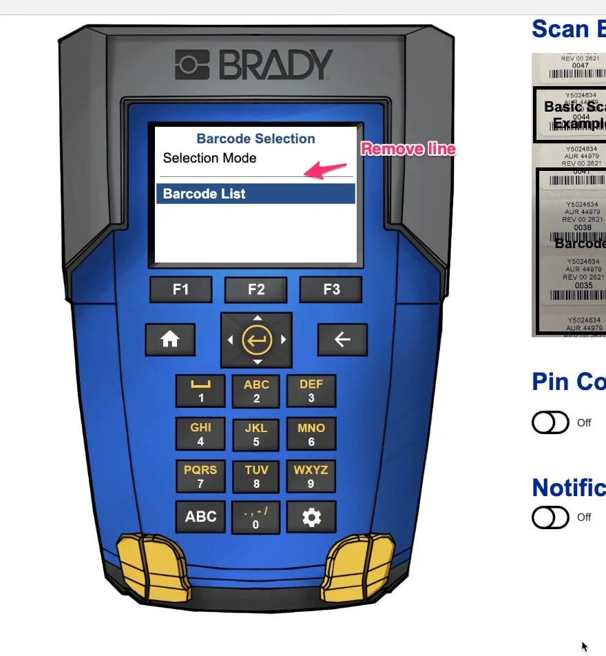
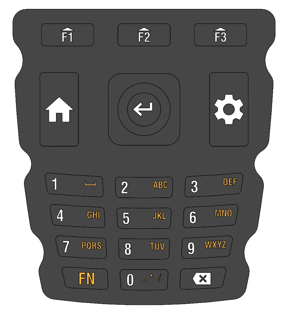
The entire interface runs on a physical keypad and three soft keys — no touch. Every screen had to be navigable with a d-pad and legible at a glance, obvious to someone who would never open a manual and often worked in gloves.
A screen you could cover with a thumb
Barcode selection, symbology, host connection, settings, battery — all of it had to fit and stay readable on a tiny display, in warehouse lighting, without burying anything more than a click or two deep.
Barcode types no one memorizes
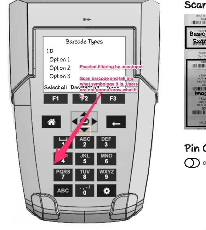
People scan a barcode and usually don’t know its symbology — 1D? Code 128? QR? The interface had to let them find and filter barcode types by what they could see, not by jargon they’d never learned.
Designing the interface, icon by icon.
With no touch, the whole interface had to work through a keypad, a d-pad, and three soft keys. I designed the screens around that constraint: barcode selection, a scannable list of symbologies, and a keypad layout mapped to how people actually move through the UI.
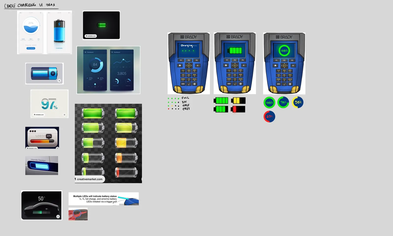
Then there’s everything you only notice when it’s missing: battery and charging. I worked through the charge states, the cradle screens, and an LED language — full, half, low, critical — so a single glance tells you where the device stands.
Supporting artifacts: Exploring the charge, battery, and cradle-LED states
It shipped as the Brady V4500.
Ranger shipped as the Brady V4500 — a rugged Bluetooth scanner built to survive eight-foot drops and 75,000 scans a shift. Brady’s own product page describes the on-device work in a single line: go from setup to first scan in seconds.
Along the way, the barcode-selection flow, icon system, and keypad model I designed became the scanner’s default experience — the dynamic UI a warehouse or lab tech meets the moment they power it on.
Brady V4500 · Part 177229
MIL-STD-810G · 8-ft drops
Screens, icons & keypad
Battery & charging states
Dynamic setup-to-scan UI
Moderated user testing
Multi-language sessions
Field & lab testing
The best industrial UI is the one a gloved hand can drive without looking twice.
— Alan Schwegler · Lead UX Designer, BradyBrady — Product Experience
Product Experience (PX) team
Alan Schwegler — Lead UI, icons & testing
Brady — Hardware & Firmware
Industrial design
Firmware engineering