 Alan Schwegler
GLAS: a world-class experience for a thermostat you could see through.
GLAS began as an idea in Johnson Controls' 2014 Tech Challenge — a smart thermostat with a transparent screen and a genuinely futuristic feel. Once the industrial design was set, the UX team was brought in with one ask: deliver a world-class digital experience across device, mobile, and web.
The work at a glance.
- The problem
- Homeowners needed useful energy and air-quality information on an unfamiliar transparent display.
- My responsibility
- Creative Lead within JCI UX, working with research, engineering, and technology partners.
- The key decision
- Use residential research to prioritize energy and air quality; design graphics around the OLED’s transparency instead of treating it as a conventional screen.
- The outcome
- GLAS launched in August 2018. The product earned a CES Innovation Award; those are team and product outcomes.
Let research determine what deserved the screen.
A residential thermostat needed a different feature focus from JCI’s commercial building controls.
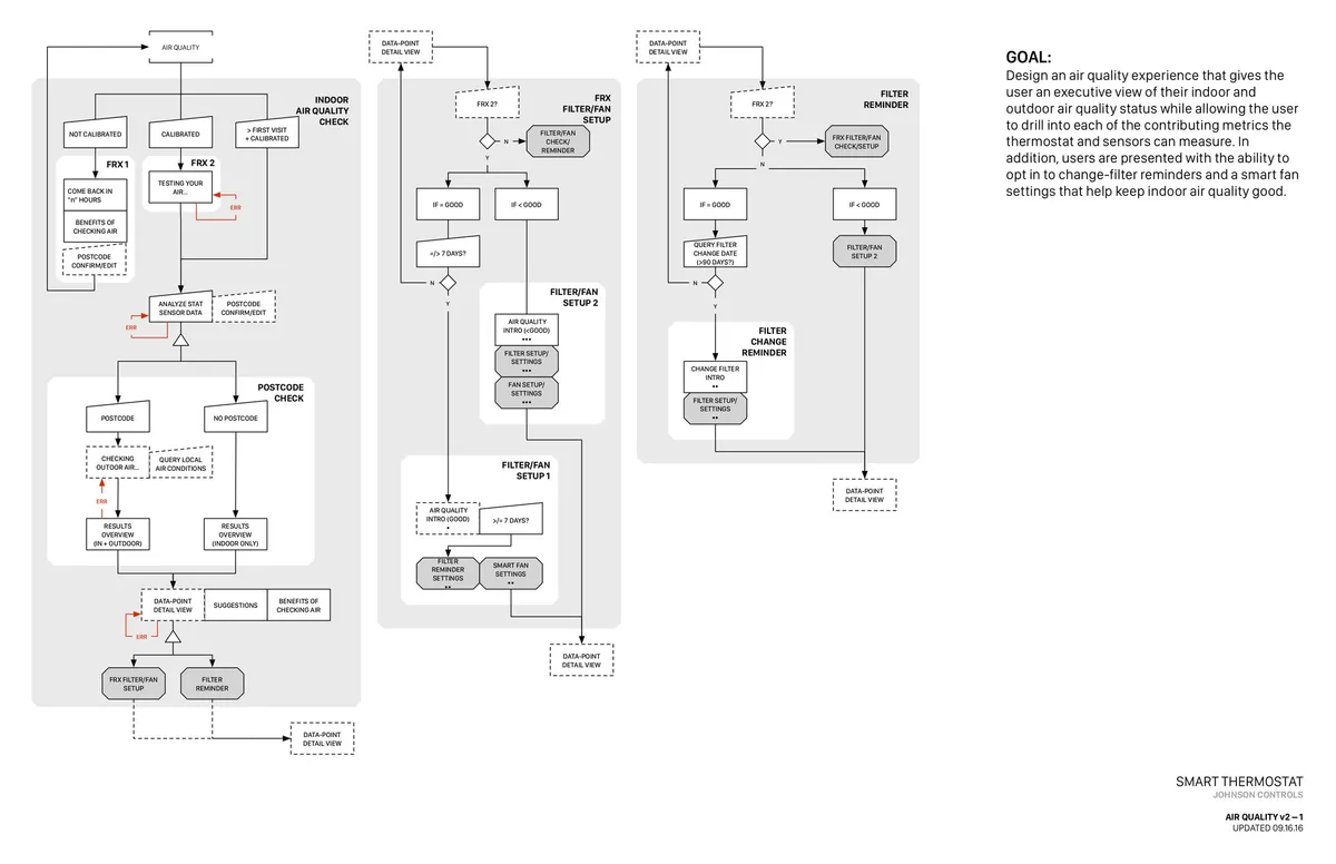
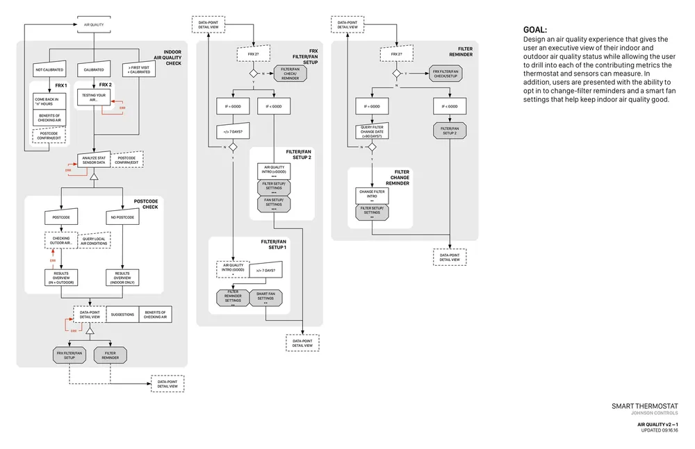
Use home research to prioritize energy savings and air quality for Release 1, then translate those needs into device flows.
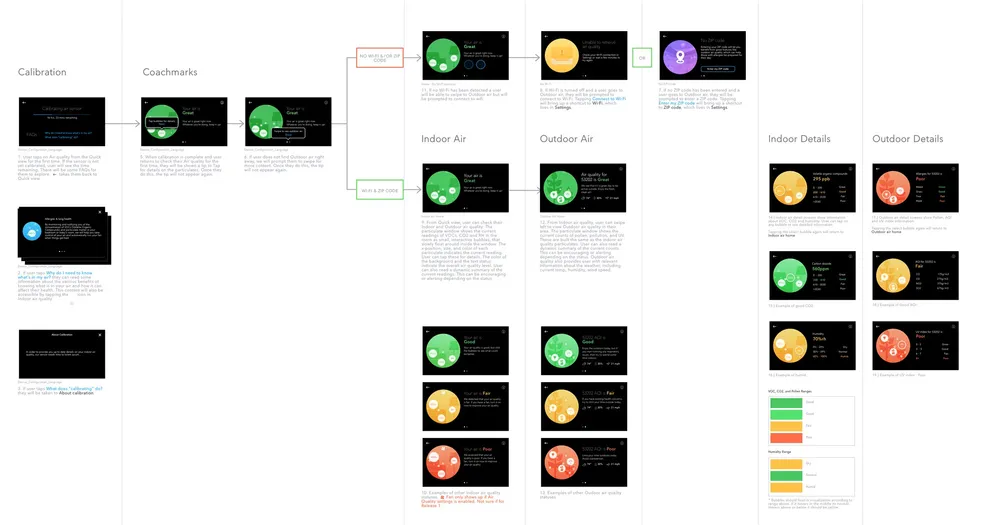
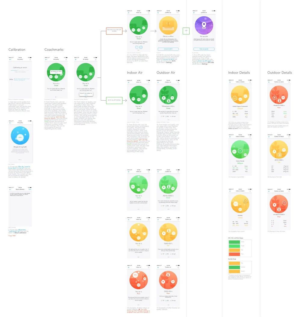
The air-quality flow connects a research priority to the interface. It shows how the team moved from feature selection to implementation.
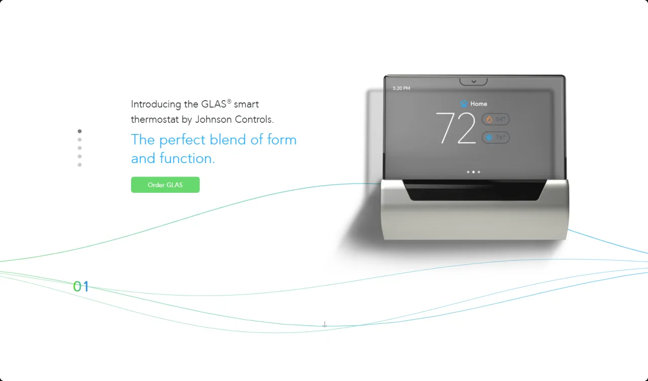
From a tech-challenge concept to a shipping product.
The JCI UX team started with a hi-fi prototype full of blue-sky thinking — and quickly hit a wall. Our expertise was in large commercial buildings, not residential products someone buys on Amazon or at Home Depot. So we partnered with Smashing Ideas, a Seattle design firm that specializes in digital experiences.
Smashing Ideas ran JCI’s UX, engineering, and leadership through our first ideation and discovery workshop — an exercise that transformed how we approach design at JCI. Within a week we’d locked the MVP scope, a visual direction, and the features that would set GLAS apart.
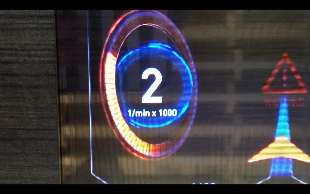
“Painting with light” — a minimal, highly saturated aesthetic that lets hyper-illuminated graphics shine through the glass.
Our first design principle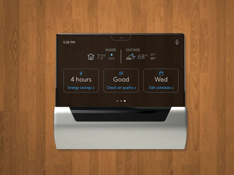
Three problems that shaped the product.
Designing for transparency
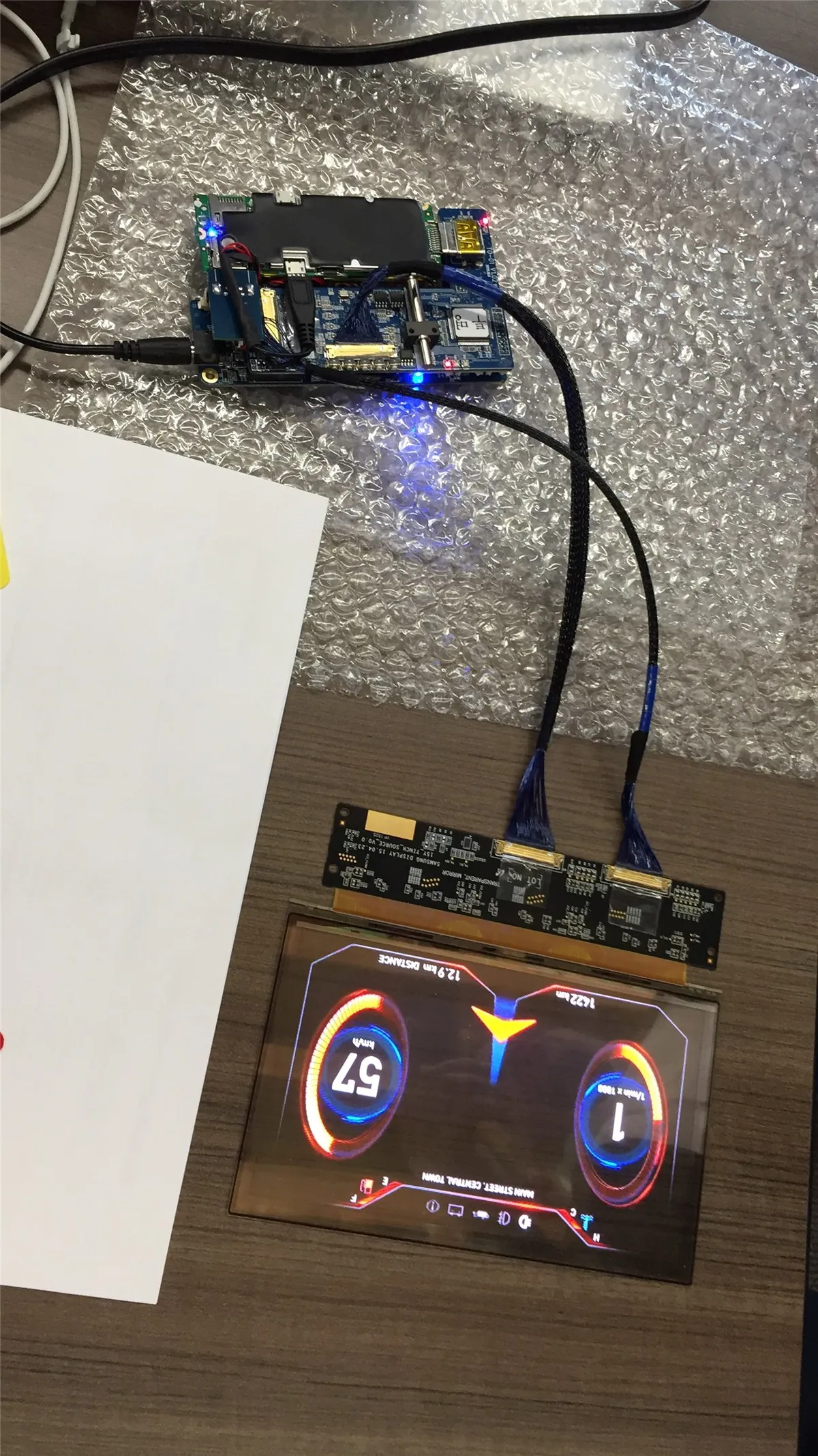
GLAS’s screen renders black and dark greys as transparent — which punched literal holes in our renders. We pulled black and every grey up to #666666 out of the palette, and it led to our first design principle: “painting with light.” Minimal but highly saturated graphics that celebrate transparency instead of fighting it.
Creating a residential-focused product
JCI had always built for complex commercial markets — nothing like a homeowner shopping for a thermostat. We went to homes across North America to learn what residential users actually wanted, and two needs rose to the top: saving energy and the air quality in their home. That research set the key features for Release 1.
Voice integration
With Alexa and Siri on the rise, GLAS partnered with Microsoft to bring Cortana on-device. Smart-thermostat voice commands didn’t really exist yet, so we ran moderated testing to find what felt intuitive — and users gravitated to comfort, not settings. “Hey GLAS, make it warmer.”
Research, flows, and the deliverables that shipped it.
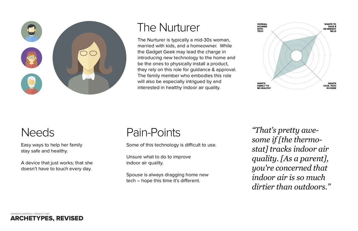
We started with diary studies to understand a customer base JCI had never built for. Two primary personas emerged — “The Gadget Geek” and “The Nurturer” — and they influenced every workstream that followed.
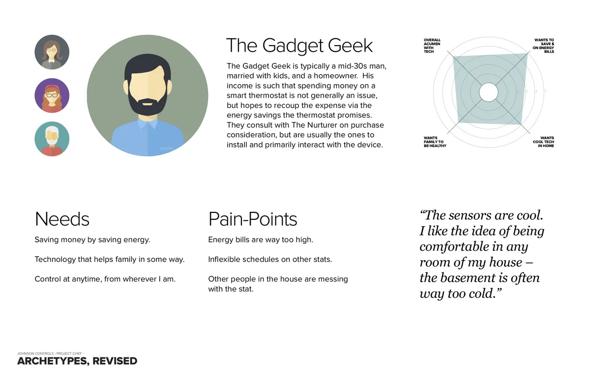
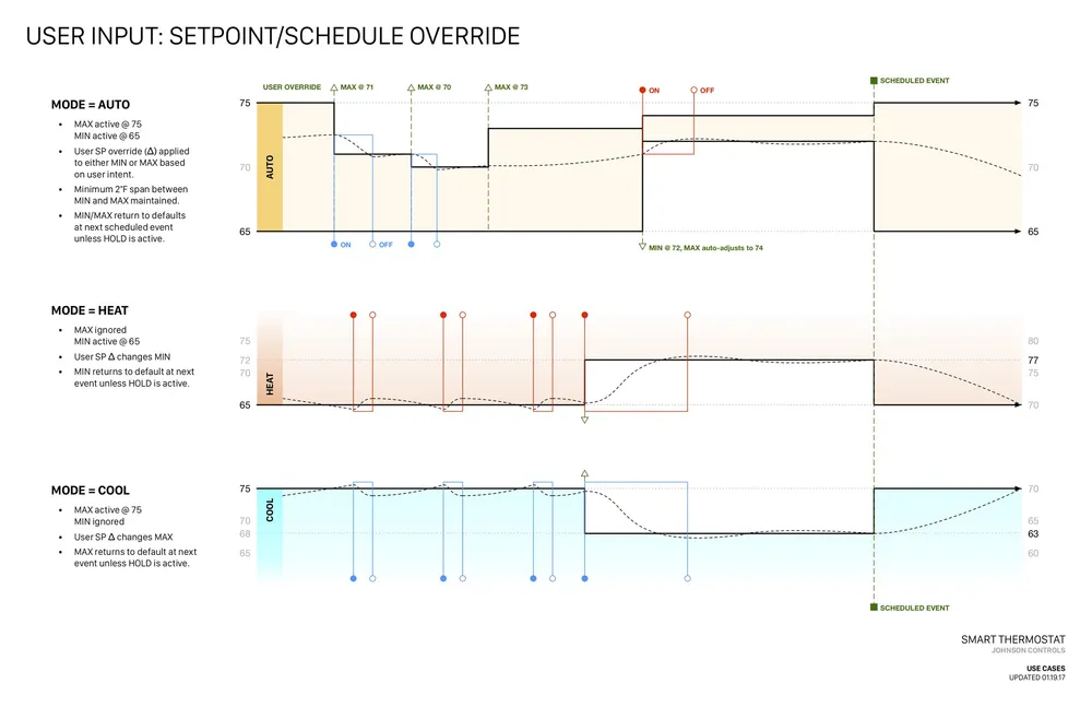
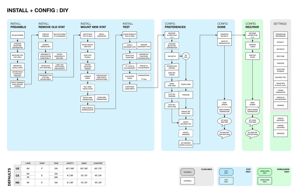
Two parallel streams followed — feature flows and mood boards, both driven by the personas. We wireframed the key features (Air Flow, Energy Savings, Scheduling) as static frames in Sketch to nail the on-device flow.
The mood boards set the visual theme — heavy inspiration from “future tech” and “timeless design,” ultimately centered on Dieter Rams’ “less is more.”
Supporting artifacts: Moodboard — Objectified
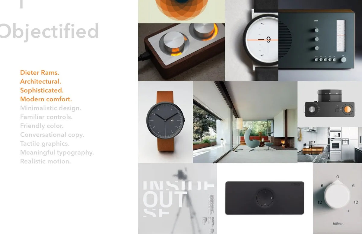
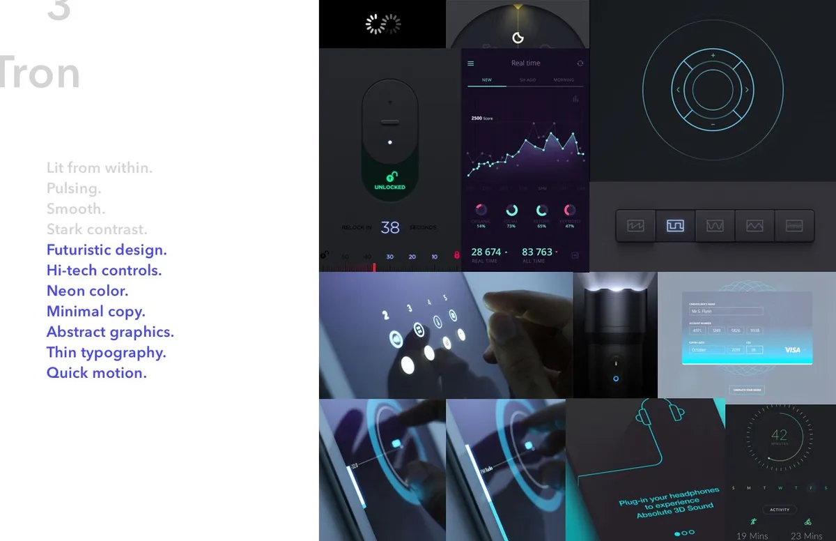
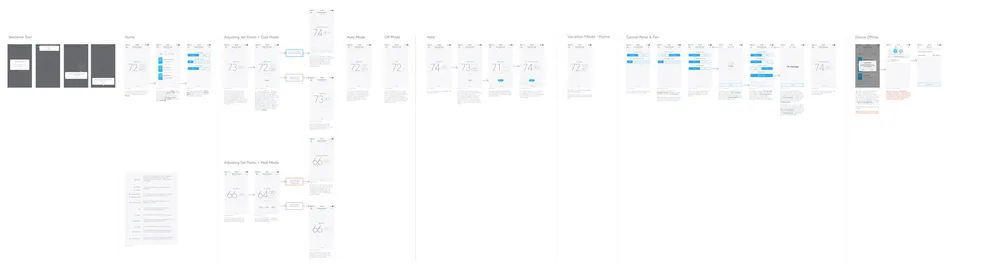
With stakeholder approval, we built hi-fi Application Maps in Sketch — static representations of the on-device and mobile flows that guided engineering through production. Pivoting in Sketch instead of production code saved the company significant time and money.
Supporting artifacts: App map — home

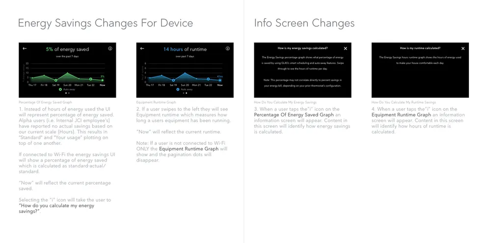

We typically start mobile-first, but here the device was the smallest screen — so device flows came first, then mobile for iPhone and Android in Release 1.
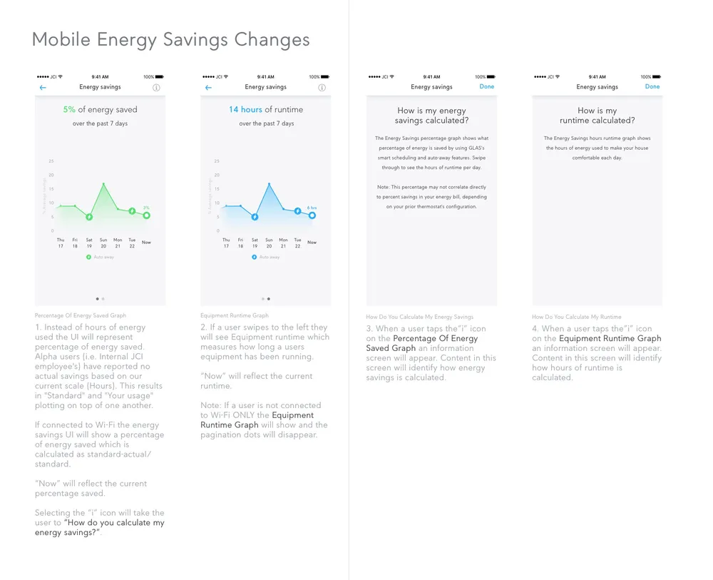
Supporting artifacts: Home — mobile

I found rapid prototyping in Axure the most effective way to communicate design intent. This prototype became the north star for development and sales — and let the UX team lead the hard technical and workflow conversations as they came up.
Supporting artifacts: Prototype — transparent display bench rig
h6dusf.axshare.com· password P@ssword!
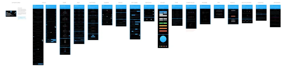
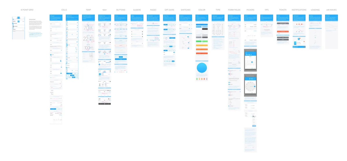
Finally, static style guides handed off color, typography, spacing, icons, and interactions to engineering — built to deliver as much as possible up front and minimize back-and-forth.
Supporting artifacts: Style guide — device
It shipped — and it got noticed.
After development, the UX team ran several rounds of moderated usability testing through UserTesting.com. GLAS entered beta, then launched on August 24th, 2018 to a strong reception across North America; the statement of work closed in February 2019.
It went on to win Control Trends’ 2019 Smart Thermostat of the Year, after being named a CES Innovation Award honoree in 2018.
CES Smart Thermostat Innovation Award — 2018
Control Trends Smart Thermostat of the Year — 2019
USD867374S1
US11274849B2
The Verge
CNET
Control Trends
I’m humbled and proud to have been part of creating GLAS — and excited to see where it goes next.
— Alan Schwegler · Creative Lead, JCI UXJohnson Controls
UX Lead — Corey Poquette
Creative Lead — Alan Schwegler
User Research Lead — Michael Seidel
Smashing Ideas
Creative Director — Drory Ben-Menachem
UX Designer — Nick Pollack
Visual Designer — Selena Goodwin
User Researcher — Lulu Hoogerheyde